
• Innova
• DashBill•Travelocity
• Dai

DashBill is a finance web application that assists treasurers and administrators of organizations in budgeting and collecting membership fees and transactions. DashBill tasked me with redesigning their website because they felt it was not exciting nor captivating, "clunky", and lacking professionalism. Studying the original website and testing the usability for myself, I identified some other weak points: inconsistent theme, unintuitive web flow, and it was unaesthetic.
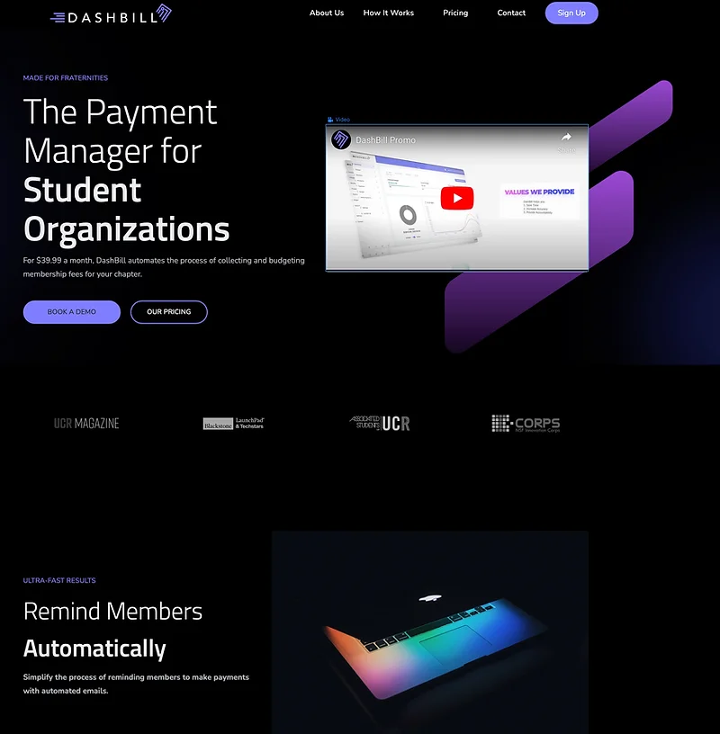
Here are some screen shots of the old landing page before redesigning:
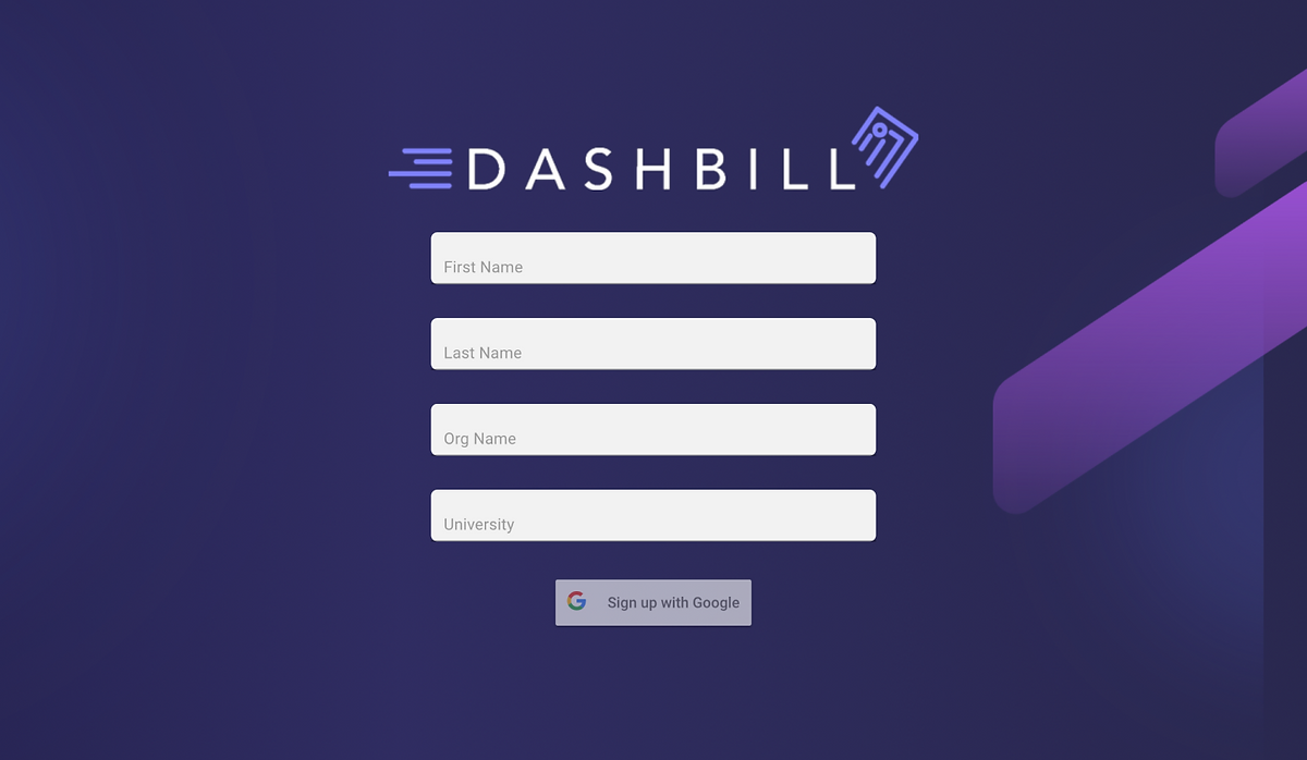
Some photos of the old log-in and sign-up page.
Let's set some goals for this project.
• Create a consistent theme that is professional, aesthetic, and dynamic.
• Re-work the web flow to be more intuitive.
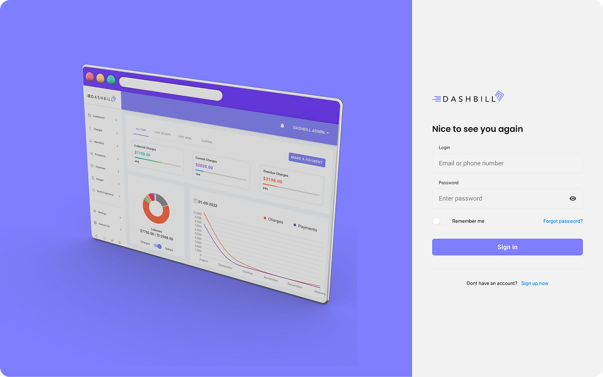
• Re-design the landing page to capture visitors' attention.
• Re-design the sign-up/log-in page to look more minimal & lucid.
• Create a budget page to act as a financial dashboard.
Unfortunately, due to the time pressure and being the only UI/UX designer, I was not able to do extensive user research. However, I was able to ask close friends and family to go through the landing page and jot down what they thought needed improvement. Their user experience helped me form a better understanding of the landing page's pain points and helped me discover breaks in the web flow, such as faulty buttons and links. Their input also informed me of the need to add a budget feature to the website. After discussion with the team at DashBill, I formed an idea of the target audience, which was predominantly males in social fraternities. Thus, I should draft up designs that will cater to that audience. Then, we collaboratively established the overall look DashBill wanted the landing page to present to its audience by identifying key words, such as clean, dark, simple, and minimal. Before I created a theme board, I made sure to look at competitor websites and note what elements could be useful for DashBill's redesign. I also looked to Dribbble (a design inspiration platform) and Pinterest for existing designs that fit our key words that I could draw ideas from. I knew I wanted to create a more dynamic website that offered more animated designs and interesting fonts.
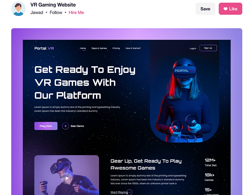
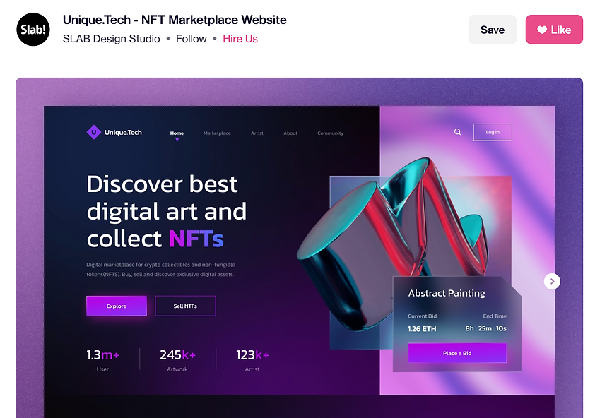
Here are some examples of designs I drew inspiration from:
With lots of research, discussion, and inspiration to draw from, I was ready to create a theme board. I loved turning our team's collective ideas into something visual, and creating a theme board gave me an easy guide to refer to when I was designing.
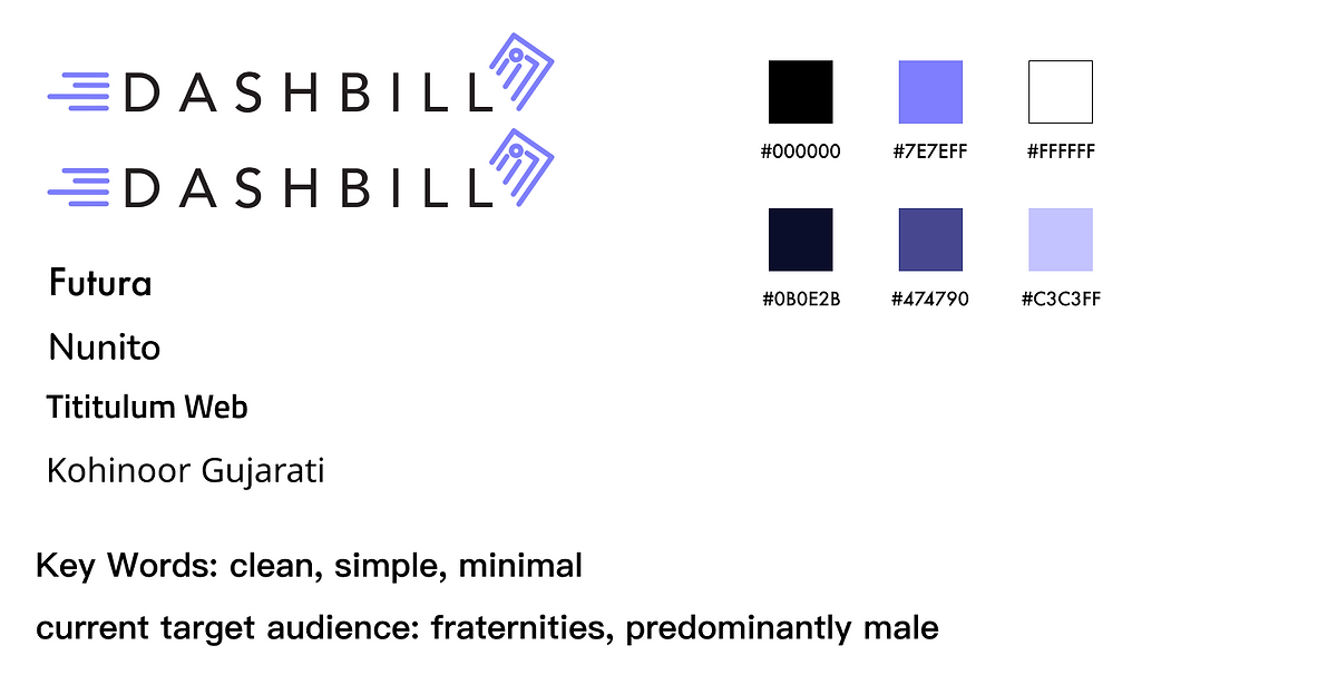
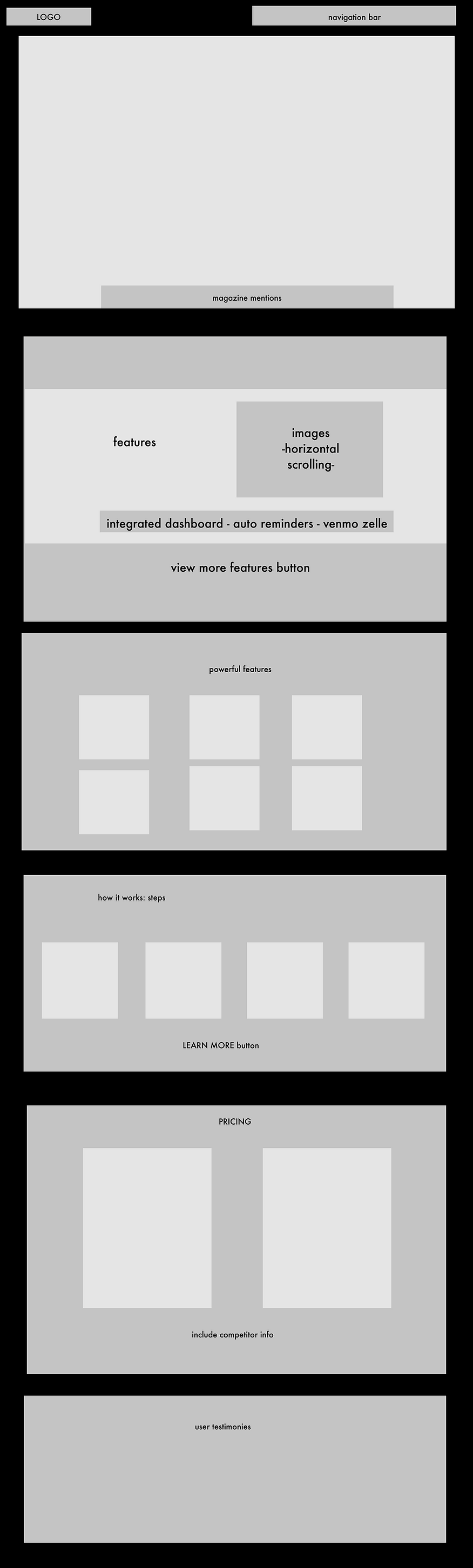
I chose base fonts that fit the key words and target audience we were going for, but also matched the style of the DashBill logo the developers had created. After a meeting with the founders and development team, I narrowed down the base colors that suited DashBill's new theme.Up next, I created the very first map of how the landing page would look. With the limited time frame, I decided to create a weird combination of a wireframe and a low-fidelity mock-up. It's not quite as developed as my usual low-fidelity mockups are, but it contains more information than my typical wireframe. A chunk of the mock-up was based off the layout of the original landing page, but with some improvements to the web flow.
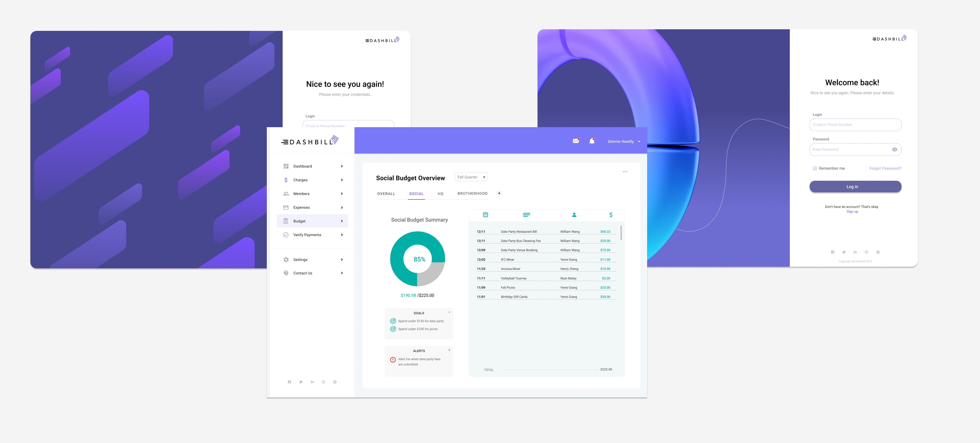
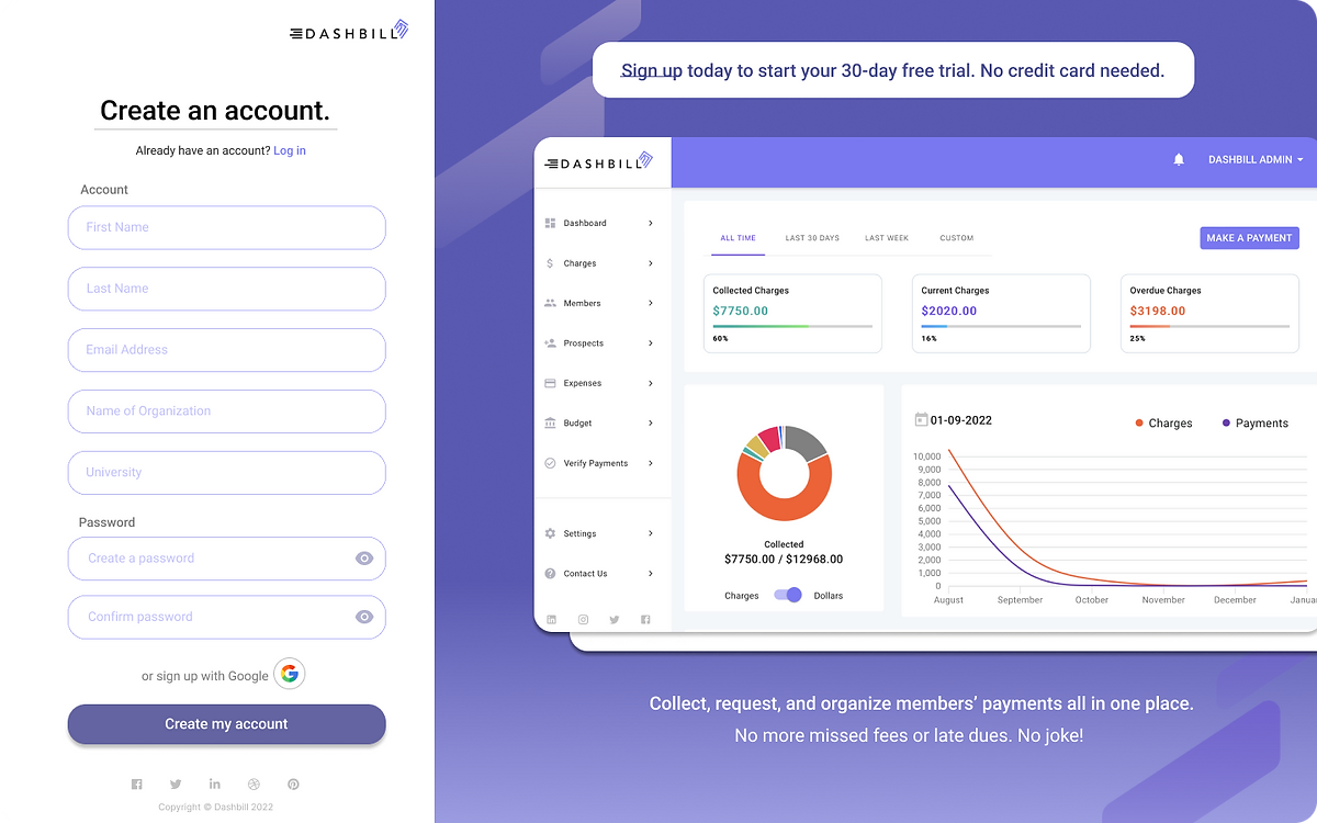
After many cafe visits, Zoom meetings, YouTube tutorials, and snack breaks, I designed the first draft of the high-fidelity mock-up. By meticulously referring to my user research, online research, and theme board, I created a detailed draft of how the website might look. I usually like to leave various comments throughout my designs that either explain a choice I made or notes questions I had. During this step, I also began prototyping the design, where I start to form the web flow of the page. I can let viewers unfamiliar with Figma see how each element flows to the next. View some of the major design changes below.
.webp)
After presenting the first draft of the high-fidelity mockup to the team, I opened the floor to comments and constructive criticism. My colleagues gave me great feedback, and offered perspective on elements I was not very familiar with. They also gave me great suggestions on how to make the web flow more intuitive, and some aspects that could be left out of the design. For some pages, I debated between two different designs. I created different versions because I was unsure which layout looked better - which I then presented to my team and had them vote which one they preferred.
For example,
In this case, Version A was the winner. During this step, I also asked my colleagues to go through the prototype and test the usability of the design. With my team's feedback, I made the corresponding changes within my skill set, or I looked up articles and tutorials to learn new design tips that helped me meet my team's needs and requests. There is always something to learn!
Let's review the goals we set.
Create a consistent theme that is professional, aesthetic, and dynamic.
We created a theme board that listed the theme's key words, target audience, color palette, and fonts. That way, we could always refer to the theme board in order to design consistent pages and frames.
Re-work the web flow to be more intuitive.
We tested the usability of the site ourselves and noted what part of the flow needed improvement. We also had our friends and family share their experience going through the web flow. The more experiences, the better. We needed to see how different people could experience the website differently, and decide which parts of the website were not intuitive.
Re-design the landing page to capture visitors' attention.
We added more dynamic and animated elements to the website to really attract visitors' attention. We also improved the aesthetics of the website through a consistent theme that fit our key words.
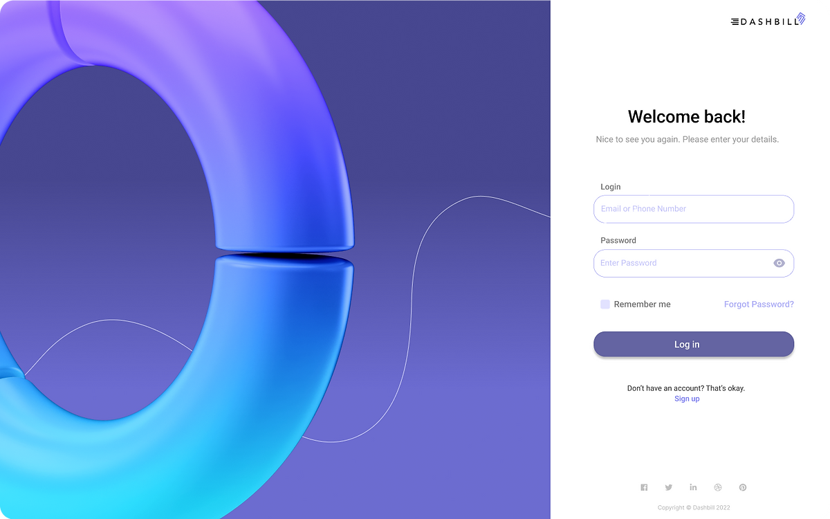
Re-design the sign-up/log-in page to look more minimal & lucid.
We removed features that were unnecessary created a design that was very straight-forward and clean-looking. We wanted visitors to be free from distractions while inputting their personal info.
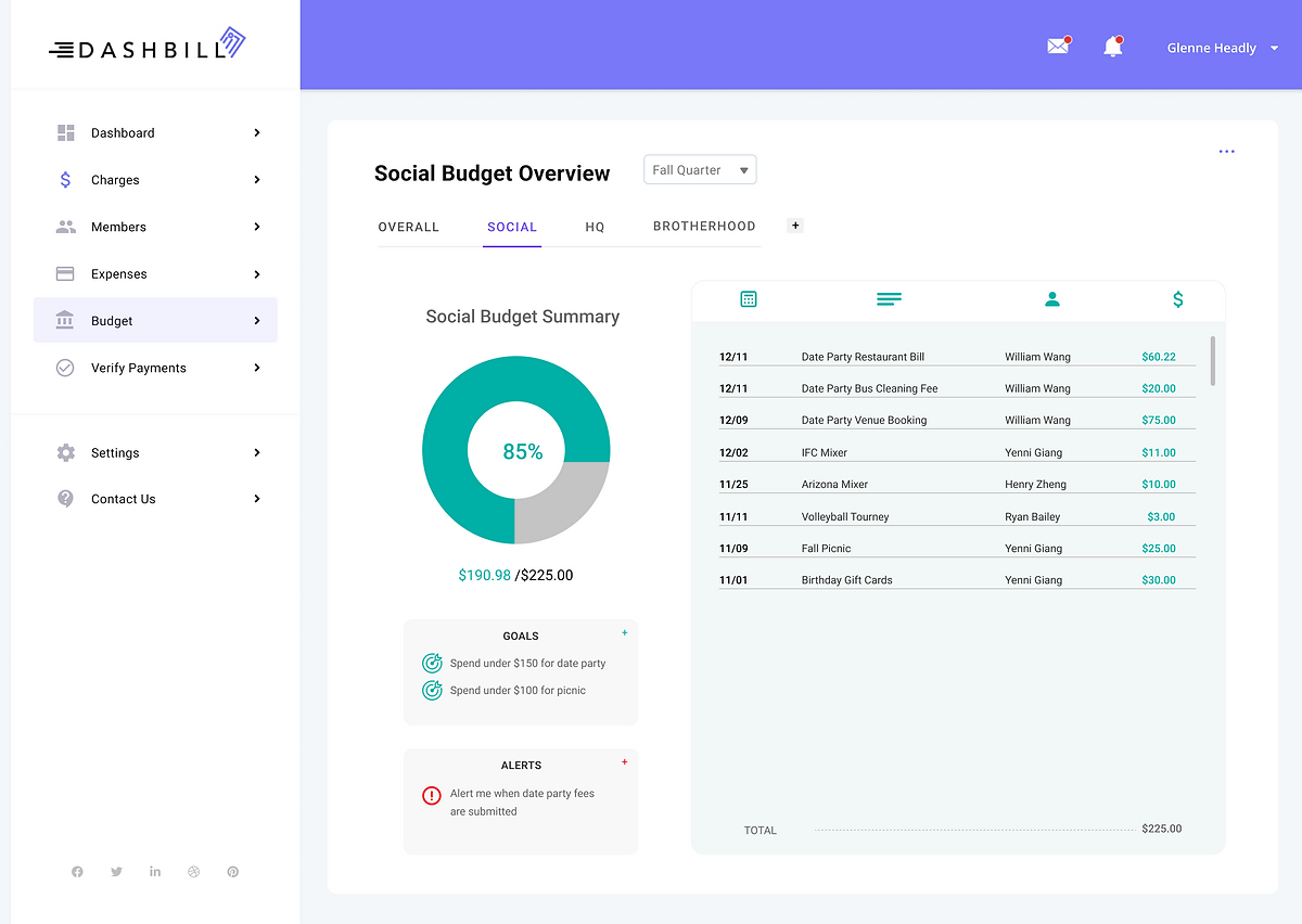
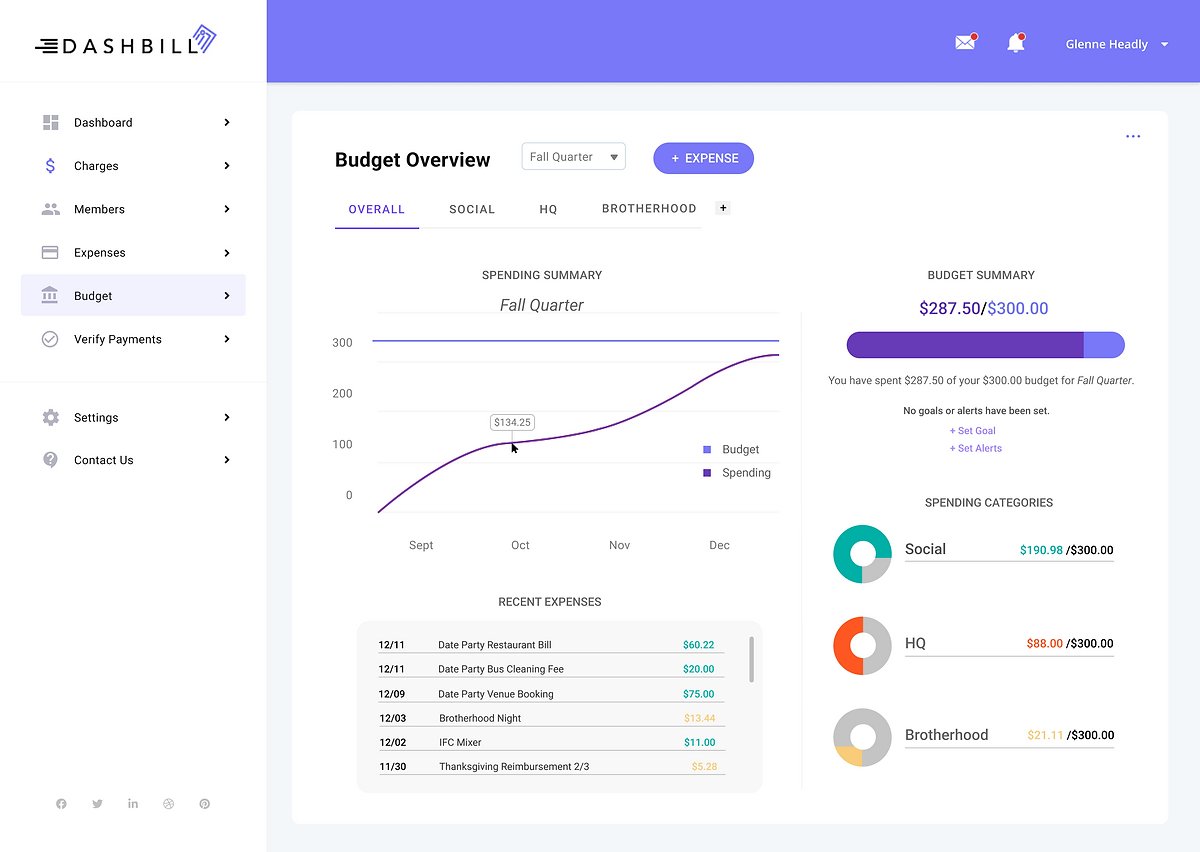
Create a budget page to act as a financial dashboard.
We created a budget page that acted as the home base for the web flow. We felt that the website needed to add another function in order to make the web flow more intuitive.
View the Figma file here!
This project was no easy feat. As my first big project as the only UI/UX designer in the team, I stumbled across a lot of hiccups and obstacles along the way. I learned so much about the UI/UX design process, and became very comfortable with Figma.
Some things I would do differently next time:
• carry out more extensive user research (although we were on a time crunch)
• create a wireframe and low-fidelity mockup for each and every design
• use the prototype feature more
Overall, this project was a great learning experience and first step into the industry. Feel free to contact me abut any questions or comments about this project!
The design-a-thon prompt was to "redesign Travelocity to better the user's experience by improving the flow and mobile interface". After studying Travelocity, an online travel agency app, and other competitor travel apps (such as Hoppr, Expedia, etc.) we identified the key weak points and set some goals to work on:
For the User Experience, we wanted to
• rework how prices are displayed upon choosing tickets
• improve the "Account" section
• add an itinerary and "things to pack" feature
• add a wallet feature
• create travel packages
• add a map feature create a "things to do" feature
• add a COVID-19 travel restrictions feature
• create a clear organizational hierarchy
For the User Interface, we wanted to
• increase the frequency of the logo
• create a consistent color palette
• redesign how hotels and flights are presented and compared
• redesign the rating system
• color code price comparisons
• create an intuitive navigation bar pinned to the screen
• remove search engine
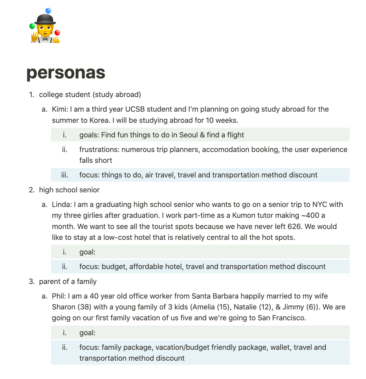
At this step, we conducted research on how other travel apps functioned and which demographic made up the largest audience for these travel apps. We narrowed down our target audience to be students and families traveling on a tight budget and looking for a deal. With this in mind, we focused on highlighting cost and simplifying booking vacation-package deals.T he time pressure of the design-a-thon limited the extent to which we were able to conduct user research, but through various articles and online data collection, we were able to create 3 unique personas on Notion.
Meet our personas and read their brief user stories:
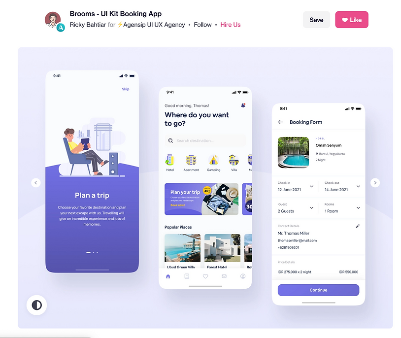
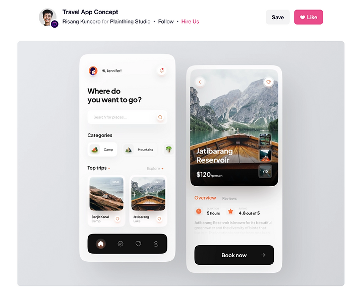
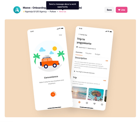
After we gained a more comprehensive overview of who we were designing for, we started to look at Dribbbl (a web design inspiration platform) for creative inspiration. After discussing as a team which aspects of the website we wanted to focus on, we saved some designs that spoke to our goal for the redesign. Here are some examples:
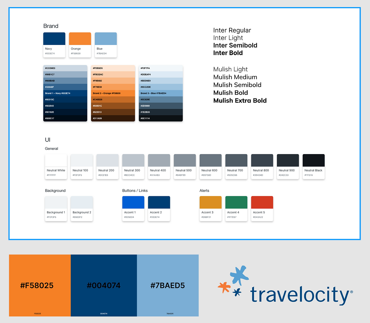
With lots of research, discussion, and inspiration to draw from, we were ready to create a theme board. We combined the app's existing colors and fonts into a theme board, highlighting the main colors that we want to keep consistent throughout the app as well as the logo.
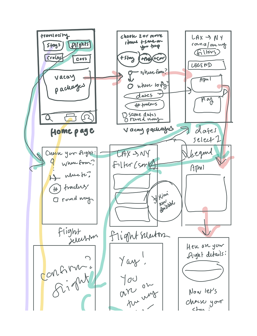
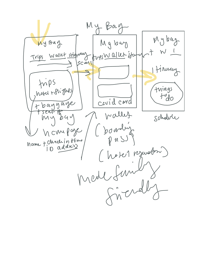
Up next, we started to sketch the wireframe. We wanted to map exactly which screens we would recreate and how each screen would flow to the next. Some of the wireframe was built on the app's existing web flow, while the new parts we wanted to integrate were created from scratch. The wireframe got super messy as I got excited jotting my ideas, but it gave a general idea of our thought process at the early stages.
After spending a whole day planning brainstorming our design, we began to design with about 48 hours left before the deadline. We first created a low-fidelity mockup based on the wire frame we had created.
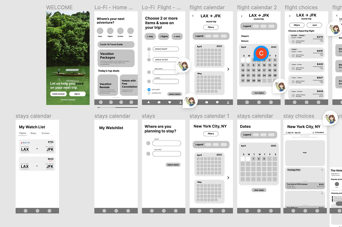
The low-fidelity mockup allowed us to refine our ideas and laid down the skeleton of design to which we will add details to. It also allowed us to plan the web flow of our design and decide which frames we should add or remove. Once we were satisfied, we began to design the high-fidelity mockup, the first detailed draft of our design with attention to color, font, and aesthetics. We also solidified how we wanted our added features to appear and work.
We prototyped our design to show viewers how we wanted our frames to work together and present the overall web flow. This was a super important step for us because we had designed so many new frames - we needed a way to organize the different pathways and make sure our product was usable. Moreover, we wanted to make sure our added features improved the overall user experience of the app, rather than complicate it. We divided the work by splitting up the screens based on the purpose of each frame. Then, we looked over each other's work and added comments and notes. After viewing each other's comments, we met up in person to discuss the necessary changes we needed to make to our design, as well as do a mental health check.
Once we felt satisfied with our design, we submitted our file to receive feedback by two UI/UX Designers in the industry. Needless to say, we received A LOT of feedback on how we could improve our design. For the user experience, the designers loved our "travel package" idea, but thought the web flow of the feature itself needed revision. They also commented on the lack of clarity in the process of booking flights, and noted that color coding based on price could be an accessibility problem. However, they loved the added feature of the wallet and itinerary to really personalize the audience's trip.For the user interface, the designers enjoyed the consistent color palette and branding throughout the design, but would have loved to see even more branding. They thought the images we added were helpful, but thought our use of drop-shadows and bolding excessive.Overall, we were really grateful that the designers took time out of their day to look over our design, and were excited to work on a new and improved design. There is always something to learn!
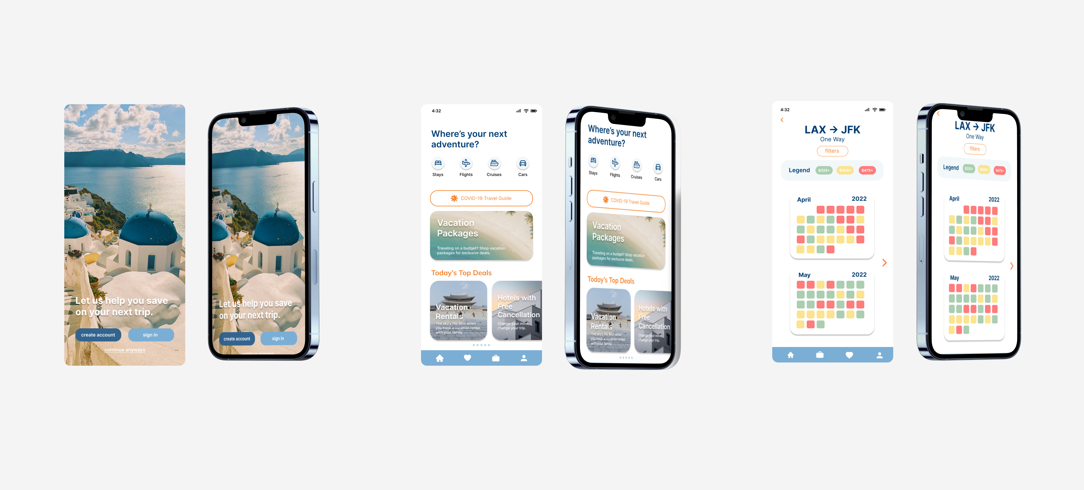
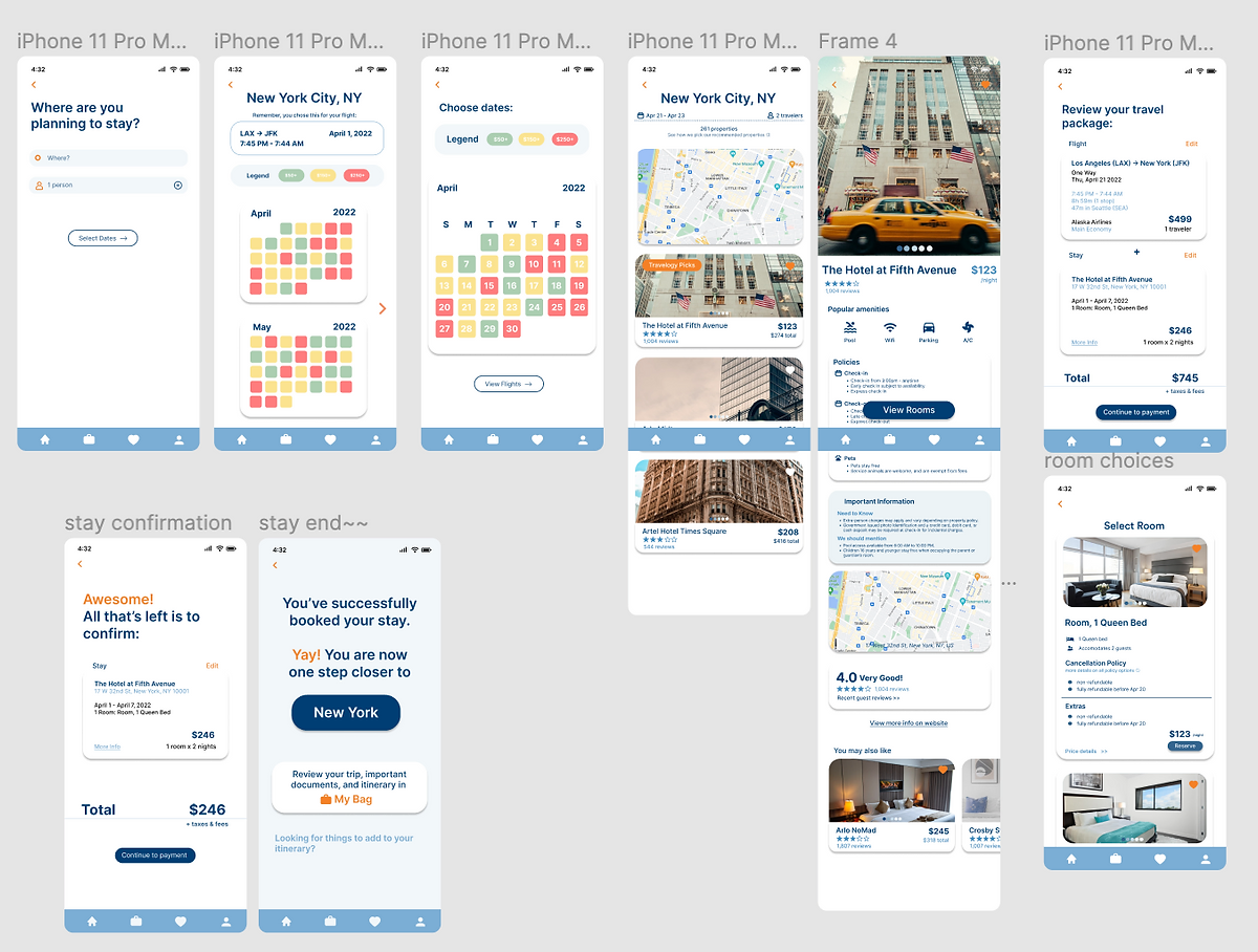
We decided to focus on a target audience of students and families–people traveling on a tight budget looking for a deal. With this in mind, we focused on highlighting cost and simplifying booking vacation-package deals. Thus, the search engine on the home page was removed as we concluded the target audience would use Travelocity to get the best discounted rates for their already existing travel plans. ‘Vacation Packages’ is now spotlighted, as it is the most useful budget-friendly function.
For easier navigation, we revamped “Today’s Top Deals” to scroll horizontally to improve user experience–fitting everything into one screen. Addressing user-experience and convenience, a map was added to the hotel page to allow users to conveniently locate and book hotel reservations. To cater to our economical audience, we redesigned the calendars to be color-coded by price: visually showcasing which days are most cost-friendly for their flight or stay. In addition, the Covid-19 section was redesigned to show updated guidelines for countries of their choosing. A fourth section, ‘My Saves List,’ was added to the navigation bar to provide users an accessible and organized way to keep track of all their saved flight and hotel inquiries. This allows users to watch the price changes for their saved flight and hotel. The ‘Trips’ section was changed to ‘My Bag.’ This section contains ‘Trips,’ ‘Wallet,’ ‘Itinerary,’ where users can find their confirmed bookings, boarding-passes, and trip itinerary respectively. This was created with the intent to help users–especially larger families and newbie travelers–stay organized during their vacation.
For the user interface, we incorporated the brand’s voice through their color-palette while still catering to our audience of families and young students with a bubbly but modern design. As compared to the original, the accents of orange and light blue help legibility and highlight important information.
Play with our live prototype!
As this was all of our first experiences in a design-a-thon, we made a lot of mistakes and had to rely on multiple sources for help. For me, this was a great lesson in teamwork under a time pressure and great practice using Figma.
Some things I would do differently next time:
• conduct more extensive user research (though we did only have 72 hours)
• focus more on planning the web flow
• better plan new features so I don't get confused while designing
• weigh less importance on low fidelity mockups
• consider accessibility options
I would love to chat anytime about this project or anything else related to UI/UX. Don't be a stranger!

If you like what you see and want to work together, get in touch!
yenni.t.giang@gmail.com

